
In today’s digital age, having a website for your business or personal brand is essential.
However, simply having a website is not enough. With the increasing use of mobile devices, it is important to ensure that your website is optimised for all screen sizes. This is where responsive website design comes into play.
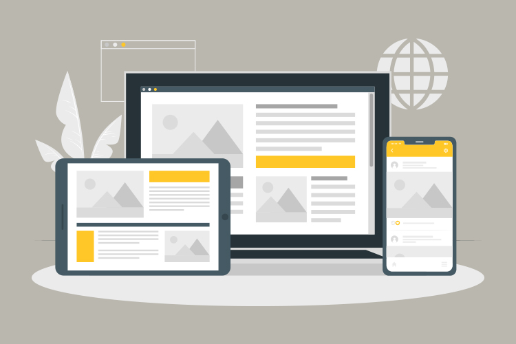
Responsive website design is an approach to web design that allows a website to adapt to different screen sizes and device types. In other words, a responsive website is one that looks great and functions properly whether you’re viewing it on a desktop computer, a smartphone, or a tablet.
In this blog, we will dive deeper into what responsive website design is and why it is important for your business or personal brand.
What is a Responsive Web Design?
Responsive web design, commonly referred to as RWD, is a contemporary web design methodology that aims to ensure that a website can be viewed seamlessly across an array of devices with varying screen sizes.
This approach involves designing a website in a way that it adjusts its layout and content to fit the specific screen size of the device being used, such as a desktop, laptop, tablet, or mobile phone. In other words, it is an intricate process of crafting web pages that retain their visual appeal and functionality, regardless of the device used to access them.
By implementing a responsive web design strategy, businesses and individuals can ensure that their website visitors enjoy a consistent and optimised experience, no matter how they choose to access the site.
This makes responsive web design a crucial aspect of website development and an essential tool for any organisation or individual looking to enhance their online presence.
How Does a Responsive Web Design Work?
Well, are you wondering how a responsive website works? Responsive web design works through CSS, using various settings to adjust your website to various devices. If you are not familiar with CSS, don’t worry; we will explain it in detail. CSS is an acronym for cascading style sheet, and it is a mark-up language. As a mark-up language, it is used to add designs( like colour, font size, and animation) to a website.
CSS is the primary tool that you can use to make your website responsive on all devices. An example of a CSS property that is related to responsive web design is the media query. But how does a responsive site design work?
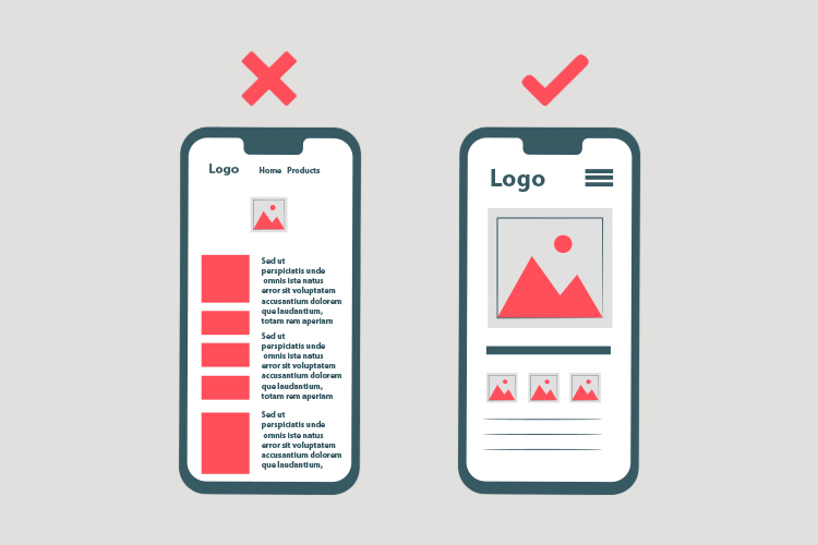
To create a responsive website, the site must be built with a flexible grid foundation. A flexible grid will divide the web pages into different columns on different devices.
For example, it can divide a div element into four columns on desktops, two on laptops and one on mobile phones. This means that the grid system will easily adjust the column size to the different device screen sizes.
And this can only be achieved using the CSS media query. Aside from adjusting the grid column, responsive websites work by making images flexible. Images with fixed sizes might display differently on large and small devices.
For example, an image that is 1000*1000 pixels large will display well on desktops and laptops but not on tablets and mobile phones. So, if you want to create a responsive web design, you will adjust the image size for tablets and smartphones so that it will look good when it is rendered.
Using CSS media query is another way to ensure that your website is responsive. To do that, you must ensure that you set the media query and screen size to adjust your content to different devices.
How Do I Check if My Website is Responsive?
Ensuring that your website is responsive is crucial in today’s digital age, as more and more people use their mobile devices to browse the internet. With a responsive website, visitors can access your content from any device, without having to zoom in or scroll horizontally to view the content. But how can you tell if your website is responsive?
One way to check is to use a browser’s built-in tools, such as Chrome DevTools. As mentioned earlier, you can open DevTools by pressing Ctrl + Shift + I on your keyboard, which will display a variety of tools for developers.
To check your website’s responsiveness, you can click the icon in the top-left corner of DevTools, which looks like a phone and tablet, to toggle the device toolbar.
From here, you can choose from a range of devices, including desktop, laptop, tablet, and mobile phones, to see how your website appears on each device.
If your website’s content displays correctly on each device, then it is responsive. However, if your website’s content is not rendered properly, such as text and images being cut off or distorted, then you may need to work on making your website more responsive.
Another way to check if your website is responsive is to use online tools that provide a more detailed analysis of your website’s responsiveness. These tools can also help you identify specific areas that need improvement, such as image optimization, page speed, and mobile usability.
Checking if your website is responsive can be done by using browser tools like DevTools or online tools that provide a more detailed analysis. By ensuring that your website is responsive, you can provide a better user experience for your visitors and increase engagement on your site.
Why You Need a Responsive Web Design Now
There are several reasons business owners need a responsive website.
One Website, Different Devices
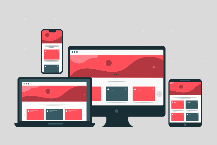
Gone are the days when businesses needed to create separate websites for desktop and mobile devices. With a responsive web design, you can ensure that your website looks and works perfectly on all devices, including desktops, laptops, tablets, and smartphones.
This means that you can maintain a consistent brand image and provide a seamless user experience, regardless of the device your visitors are using.
Accessible to Millions of Online Visitors
The number of people using mobile devices to access the internet is increasing rapidly, and a responsive web design can help you tap into this growing audience.
By ensuring that your website is accessible and easy to use on mobile devices, you can attract more visitors, generate more leads, and ultimately increase your revenue.
Cost-Effective

Creating and managing multiple websites for different devices can be time-consuming and expensive. With a responsive web design, you only need to create and manage one website, which can save you time, money, and resources.
Additionally, a responsive design can reduce your bounce rate, increase your conversion rates, and improve your search engine rankings, which can lead to a higher return on investment (ROI).
Conclusion
In conclusion, a responsive web design is essential for any business that wants to succeed in today’s digital world. Not only does it provide a better user experience, but it can also save you money and help you reach a wider audience.
If you haven’t already made your website responsive, now is the time to do so. By investing in a responsive web design, you can future-proof your website and stay ahead of the competition.
